The redesign project of the ANAF online platform aimed at transforming a complex governmental platform into an accessible and intuitive digital solution. The main users are individuals and companies that frequently interact with the platform for tax declarations, and the UX/UI audit was performed to reduce frustration and increase the efficiency of usage.
Challenges of the Initial Platform
1. Outdated and Inefficient Interface
- The old design was visibly outdated, with clumsy layouts and obsolete structures.
- Visual elements were inconsistent, and the use of fonts and colors did not adhere to accessibility principles.
2. Confusing Navigation Flows
- Users encountered difficulties finding forms and important sections.
- The lack of a clear guide or an efficient search function added extra time to every interaction.
3. Lack of Accessibility
- The platform was not optimized for mobile devices.
- Options for users with disabilities were non-existent.
Redesign Strategy
1. Extensive Research
- User behaviors and needs were analyzed through direct feedback and usability studies.
- Key points of frustration and critical tasks for users were identified.
2. Redesign Objectives
- Simplify interactions and create a logical navigation flow.
- Introduce modern functions and an accessible design for all users.
3. Testing and Iteration
- Prototypes were iteratively tested with real users to identify issues early on.
Implemented Solutions
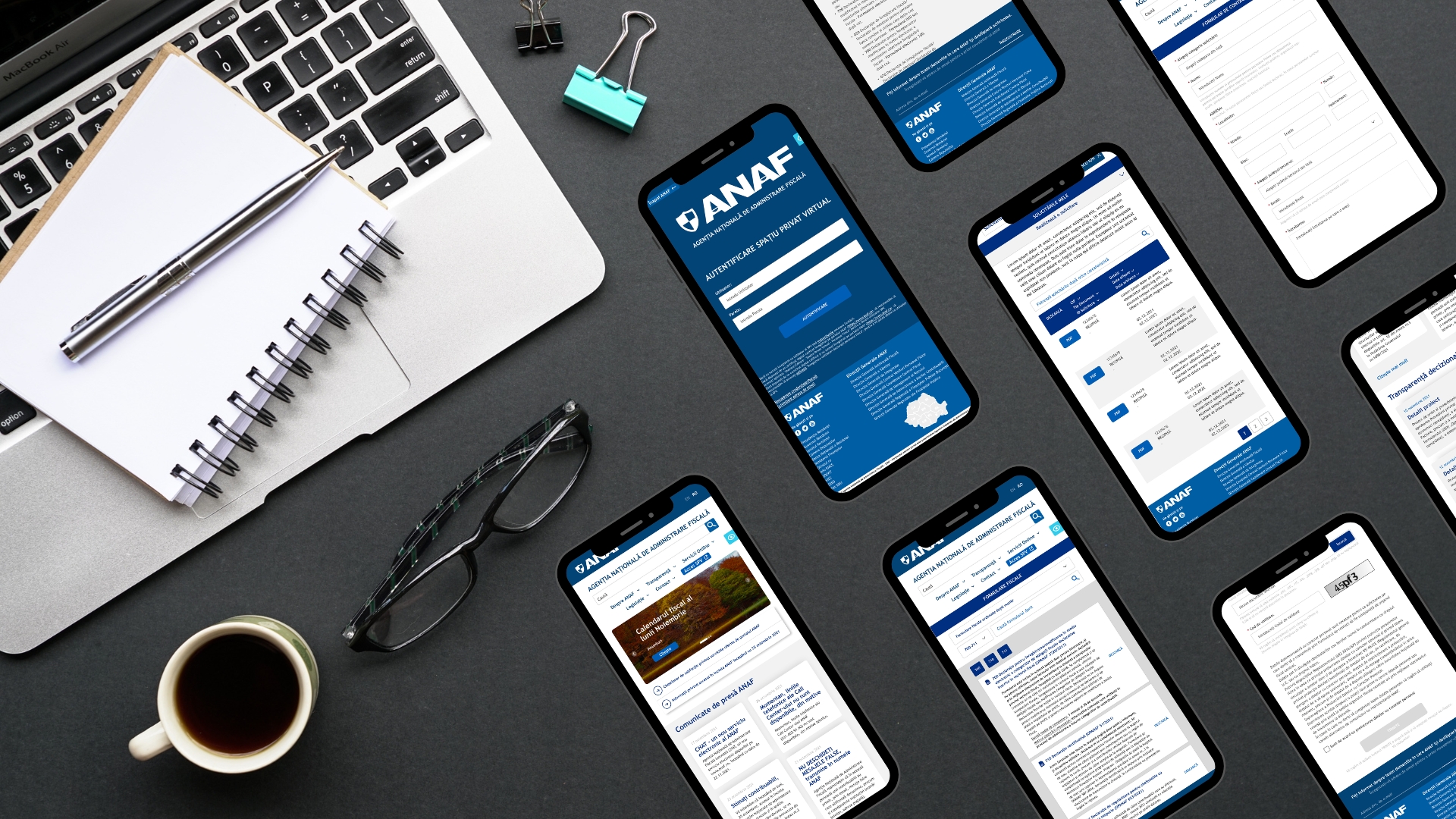
1. Modernized Interface
- The design was completely redone using a clear visual guide, including contrasting colors and accessible fonts.
- Intuitive icons and visual cards were used for categories and key actions.
2. Simplified Flows
- Centralized Dashboard: Users can access critical sections (declarations, payments, reports) from a single place.
- Advanced Search Function: Implemented a search bar that prioritizes the most frequently accessed functions.
3. Mobile Optimization and Accessibility
- Responsive Design: The platform was optimized for mobile phones and tablets.
- Accessible Features: Introduced options for users with disabilities, such as text enlargement and high contrast modes.
4. New Features
- Custom Notifications and Reports: Users receive real-time notifications about tax deadlines and outstanding documents.
- Interactive Guides: Educational sections directly integrated into the platform to guide users in completing forms.
Practical Example: Simplified Tax Declarations
Initial Situation:
- Users had to navigate through multiple pages and sections to find the necessary declarations.
- There were no clear instructions or examples for completing the documents.
Implemented Solution:
- Visual Categories: Declarations are grouped logically and displayed with brief explanations.
- Interactive Assistant: Users are guided step by step through the completion process.
- Preview Before Submission: Users can check declarations before submitting them.
Expected Results and Benefits
1. Reduced User Frustration
Intuitive flows and educational functions reduce the time and effort needed to complete tax tasks.
2. Increased Completion Rates
Optimizing the interface and simplifying the flows will increase the number of users who successfully complete tax declarations.
3. Improved Accessibility
With responsive design and features for users with disabilities, the platform becomes accessible to a wider range of users.
4. Modern Positioning
The modern redesign and interactive features position the ANAF platform as a top digital solution in the public sector.
The redesign of the ANAF online platform is an excellent example of digital modernization of an essential public service. With a user-friendly design, simplified flows, and interactive features, the platform can completely transform the user experience.